Meetup Loses the Nametag
Top 10 Most Influential Rebrands of 2016: Meetup
At its simplest, a visual identity is the first of many impressions a company presents itself with. It is an introduction and just like life, it is important to make a good first impressions. Then as we get older we begin to change how we want others to perceive ourselves. We change our style, our wardrobe choices, hair color, etc to better align with our personality and priorities. Companies do the same thing. This is where branding and rebranding plays a huge role. Brands seek to introduce and reintroduce themselves to better align with their identity, audience, business goals, or time period. A great example of this is the recent redesign of the website/app/networking company Meetup.
It is crazy to me reading that Meetup launched almost 15 years ago (in comparison Instagram launched 6 years ago and Facebook almost 13 years ago), but the company has gained significant popularity in recent years. Meetup gained momentum with the rise of smartphones and the launch of its highly successful app, but the branding still felt stuck in the past. According the the company, their social network now has over 27 million members and over 600,000 meetups a month across 178 countries. All amounting to a ton of eyes viewing the brand’s visual identity, which at the time, was cleverly designed to look like a name tag. Although a little tacky, the use of a name tag fit perfectly with what Meetup was, a platform to meet, learn, play and interact in real life, but that identity had its limits.
“There are lots of reasons to love Meetup’s nametag logo, but one important reason to ditch it. The nametag represents the most awkward moment in the entire Meetup experience — the moment you have to say hello to a complete stranger.” — Jennifer Gergen, Design Director, Brand & Identity at Meetup
If you think of a brand like a person, it is easily to see that Meetup has grown up a lot since 2002. This new persona calls for an updated look and with over 27 million members, Meetup no longer needs to introduce itself to users. Instead it wants the chance to reintroduce itself to a booming audience of young tech-savvy millennials. And damn did they ever.
Gergen elaborates on the point saying, “We’ve got new apps and a new look — bright, bold, energetic, and yes, a little quirky — that captures Meetup as we’ve always known it. For the first time, our outsides finally match our insides.” The opportunity to match the culture of a company with a new visual identity is what design agencies dream of. Enter the New York design firm Sagmeister & Walsh.
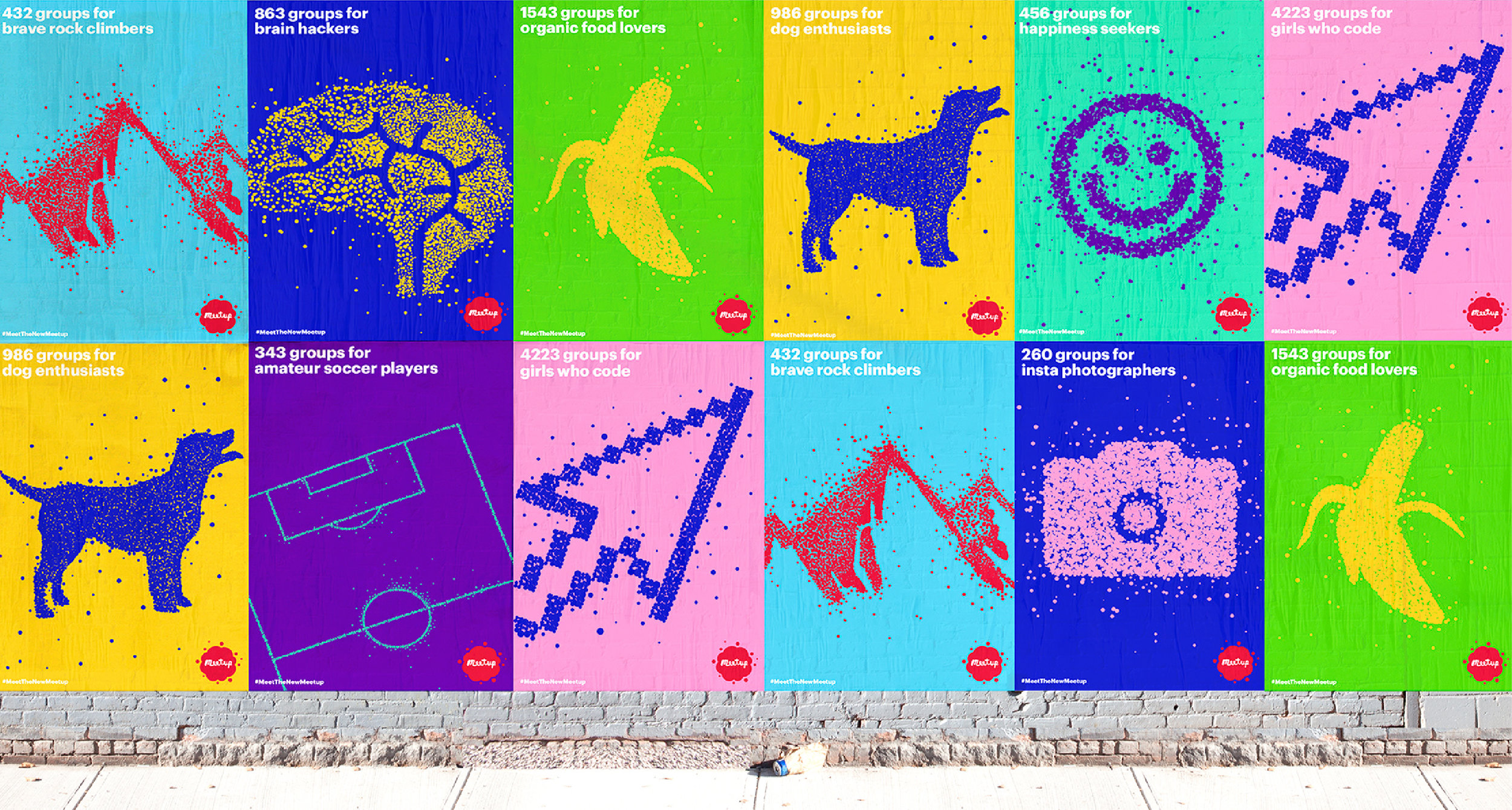
In the blog post on the company website the Design Director describes it best, “Now our logo represents why Meetup exists in the first-place — to bring people together to do the things that matter most to them. We call it the Meetup swarm.” When aligning a product with an identity, it doesn’t get much better than this. Hundreds of dots coming to gather to create a larger picture matches perfectly with the millions of users coming together every day to meet and exchange ideas.
Connecting the values, voice and visual identity to a product is the main goal of branding and the people at Sagmeister & Walsh and Meetup nailed it with this new look & logo. But the redesign goes beyond just a new logo.
They pushed the concept even further using their new visual identity to inform the categories, groups, and marketing materials for the company. The logo might be unusual, the colors might be a little overwhelming, the dots a little jarring, but the holistic approach and consistency of a concept is why this rebranding is so successful.
Another note is the bold color choice, photography, and even presentation of its marketing all speak to the young tech-savvy audience Meetup is hoping to get off their video games and smartphones to more IRL meetups. This may feel disconnected from the older generation of users who simply want to get together to run around the lake or host a play date with their kids, but you can the target audience who Meetup is trying to reintroduce themselves to. The colors might be too bright or the photography too quirky, but sometimes brands are personifications of a larger image and this design nails that.
If you’re like me and enjoy geeking out over design and branding tech companies, like Meetup, are excellent places to look. These startups are often innovating on ideas, competing for attention, and understand the value of good design. When it’s done right, it propels a brand to new heights, but when it’s done wrong, it creates confusion and angst amongst your audience. We can learn a lot from these companies, check out more in the 10 Most Influential Rebrands of 2016.
Look & Logo is a project dedicated to the design thinking that fuels creative visual identities, brands, and logos. Follow along on Twitter or Instagram to see the latest looks & logos or follow along on Medium for more in depth discussions on design. If there is work you would like to see featured or reviewed, want to talk design, or just want to say hi, feel free to get in touch.


