Mastercard Redesign
What We Can Learn from Mastercard’s Redesign
If you have already been following along to the branding and design discussions in 2016 there is no doubt you read about Mastercard’s new look when it was announced in July. The design is incredibly refined, but did it go to far? The first impression of a brand is an important statement, but only a small part in the life cycle of a new visual identity. Time is often a better critic than initial reactions, so it is important to revisit these design decisions months and even years later. But right away we can learn a lot from this new look & logo.
There is a reason why Mastercard’s old logo was instantly recognizable: they hadn’t changed it for 20 years. If I start to think about other things that happened 20 years ago I start to suddenly feel way too old. However, sometimes change is necessary. Like other designs in my list of 10 Most Influential Rebrands of 2016 you will notice a common theme: simplicity. The most noteworthy of this minimalism is Mastercard’s new logo created by the prestigious design agency, Pentagram.
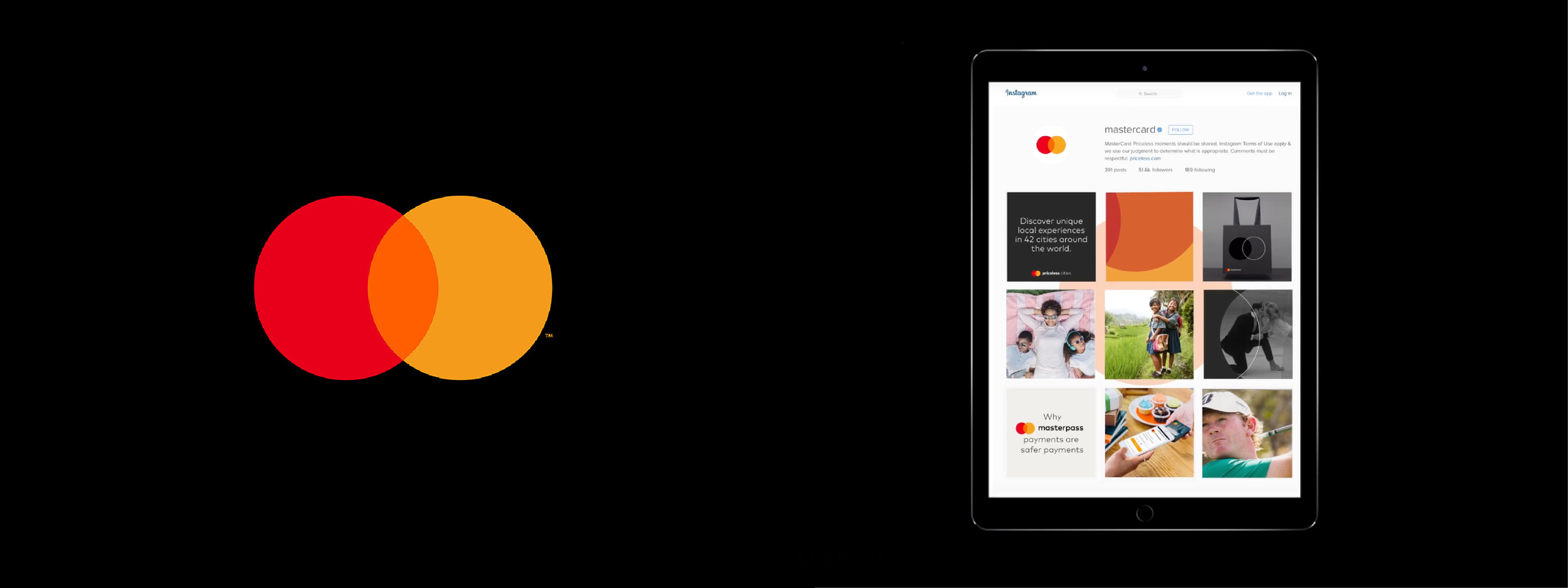
This new look for Mastercard is the definition of simplicity, and for a credit card company whose logo is everywhere from cards to billboards to stickers outside convenience stores the visual identity carries an enormous amount of value. Michael Bierut, Partner of Pentagram, made the only choice there was and kept the two iconic red and yellow circles are here to stay.
“I would not even take credit for designing this mark. We took their DNA and went through this process of distillation. With each wave of simplification it felt sharper cleaner and more flexible.” — Bierut in an interview with Fast Company
Calling back to past design styles for the company, Bierut was able to find a new color to leave his mark on the established brand: orange. It is already interesting to see how Mastercard is incorporating this third color to its palette, marketing, and acting a dividers and CTA buttons across its new app and website. This is a clever way to introduce a color, but the lack of consistency in the hue of orange leaves me confused.
Something jumped out to me as I researched Mastercard’s rebranding and it is the tagline they use on their own website about the new look and logo: “Mastercard Brand Evolution | Optimized for Digital Use”. Right away you can tell the goal of the redesign was not about introducing a new color or connecting with a new audience, instead it was created to support the company’s growing digital presence.
Mastercard and Pentagram know there are thousands of use cases for this new look and logo so instead of ignoring scalability they made it one of the design constraints, it must work for digital use. Raja Rajamannar, Chief Marketing and Communications Officer for Mastercard further elaborates saying, “To thrive in this new digital world where business moves faster than ever, we want to modernize and elevate the brand in a design that is simple and elegant, yet unquestionably Mastercard.”
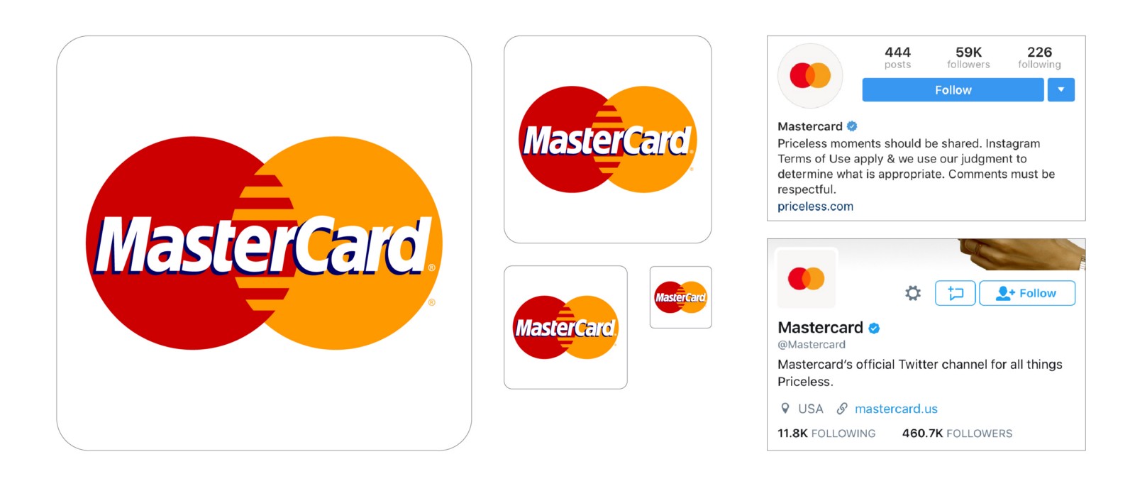
In 1996 — the last time Mastercard evolved its identity — smartphones, social media, and payment apps didn’t exist. As an experiment, I shrunk the old Mastercard logo to the necessary sizes for app icons, tablet use, or social media and instantly you begin to see why the company moved so quickly to introduce a new “digital focused” design.
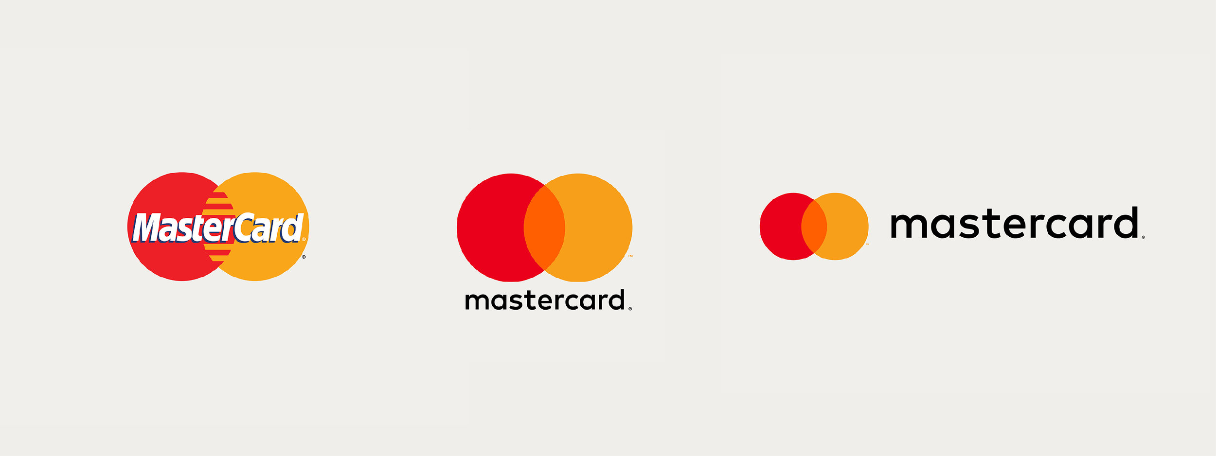
Words with drop shadows on top of shapes get very difficult to read. Add multiple colors with alternating bars in the center of the logo and the solution to simplify jumps out instantly: Remove the words, remove the bars, keep the circles. It almost seems too easy.
Another striking design change is the introduction of an all lowercase wordmark and moving it below the two circles. In the previous logo, MasterCard was the centerpiece, bold and centered and hell it even had a drop shadow to further emphasize it! The two interlocking circles have always been an asset of Mastercard since the 1960s… but for the first time in almost 50 years the company name is now relegated to take it’s place below or to the side of the iconic circles.
I could see this as MasterCard’s first step to removing their brand name all together (like they have started to do on social media) and join the ranks of the other iconic logos like Nike or Apple or Target. This seems like a weird stop gap before that change, which is odd. Why not just remove the name altogether and hang their hat on the simplicity they are striving for. This seems like they got there halfway and realized they needed the name attached to the logo — despite it throwing off the overall weight and center alignment the previous mark carried.
In addition, the all lowercase approach only leaves me confused. Going from MasterCard to Mastercard makes sense and something the company talked about at length in an effort to catch up to the times. But dropping the capital M from the logo seems over-designed. Armin Vit summarizes this in his post covering the redesign saying, “The all lowercase approach is also par for the course for how corporate logos have been behaving.” The capital M would have looked much cleaner, calling back to the established brand and previous logo without trying too hard to be “modern”.
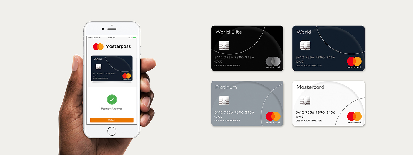
Moving away from the wordmark, let’s take a look at how the new look and logo will play out in real life. In an essence, Mastercard is going all-in on the circle and why not. They should be fortunate to have trademarked such an iconic shape that offers countless layouts and uses, which is a great proposition from Pentagram, but time will tell how impactful it really is when we start to see these in real life. The ability to relate to the consumer and tie in the Mastercard circles to everyday objects, like buttons on the Apple Watch or sponsorship of The 2016 Open golf tournament, is where this new identity will really stand out.
Through decades of exposure, the interlocking circles have become so recognizable that they can be reduced to their essence and still communicate Mastercard, at scales large and small, analog and digital, and ultimately, even without words,” says Bierut.
It may not be the most impactful first impression, but it accomplishes the goal Mastercard and Pentagram wanted to solve: optimize for digital. To that degree, it is exciting to see another major brand seek design solutions to better adopt to the world we live in while maintaining their core principles and aesthetics.
Look & Logo is a project dedicated to the design thinking that fuels creative visual identities, brands, and logos. Follow along on Twitter or Instagram to see the latest looks & logos or follow along on Medium for more in depth discussions on design. If there is work you would like to see featured or reviewed, want to talk design, or just want to say hi, feel free to get in touch.


