Alaska Airlines Modern Redesign
A Closer Look at the 2016 Alaska Airlines Rebrand
I did a double take when I read the headline that little Alaska Airlines had acquired the iconic Virgin Airlines. Instantly I realized two things: Alaska Airlines is the real deal and they are going to need a new look.
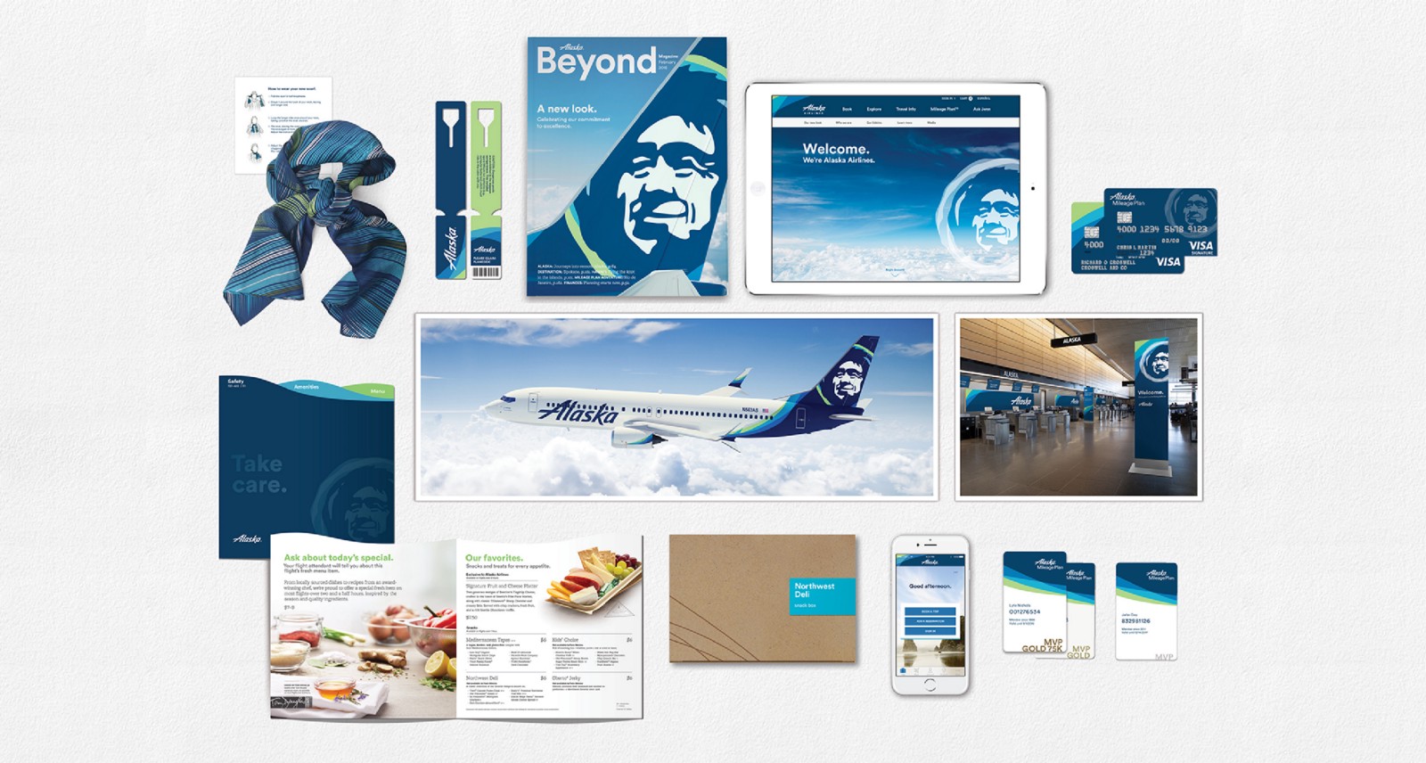
Companies decide to rebrand for different reasons and there are countless executives who sit through meetings deciding the right time to invest in a new look or logo, but one of the most natural times to rebrand is when a company’s offering or target audience expands. You can see this decision play out in how Alaska Airlines talks about its decision to create a new look and feel heading into 2017. Sangita Woerner, Vice President of Marketing of Alaska Airlines sums it up perfectly, “Our refreshed brand really is an evolution, not a revolution, of Alaska Airlines. Our goal was to reflect the soul of our company, which is known for its genuine, caring service and top-notch performance. It’s now time to show up to our customers in a bigger, brighter way.”
Think about those words for a second, here is one of the most popular airlines admitting that it’s time for our brand to show up bigger. And no doubt, with a new acquisition of an incredibly loyal Virgin Airlines customer base, the ability to show up big will play a large role in the adoption and trust these passengers share with their airline.
Something I love about Alaska Airlines brand goes beyond it’s look and logo and into who they are as a company. They fresh, honest, caring attitude they give off is infectious. And after reading Richard Branson’s The Virgin Way, it is definitely an area of alignment that will shine with the merger of these two companies. Alaska Airline’s advertising, billboards, in airport signage, website, customer service all come from a place of confidence in who they are and honesty in what they will provide. That is the power of a well established brand, built on core beliefs, reenforced by a strong visual identity. That is where the excellent design from Hornall Anderson shines.
If you simply compare the before and after of the logos you’ll notice a fresh, positive, clean look is created to support everything Alaska Airlines stands for. By contrast the old logo instantly seems dated with its scratchy texture and sharp edges in the type. From simply comparing two logos the perceived attributes of a brand go from “rough” (not necessarily a good thing when talking about flights!) to “smooth and clean”. Good design has the ability to emphasize the personality/values of a brand and why Alaska Airlines stands out as one of the most influential rebrands of 2016.
Let’s nerd out for a bit on the new Alaska wordmark and highlight a few of the design decisions the team made:
Retaining the form of the A from the old logo is instantly recognizable with its strong horizontal bar and gap in the letter make it unique and memorable.
The rounded edges in the vertical caps on each letter create the smoothness that was missing from previous versions of the wordmark.
The italic lean of the letters create a movement and energy that fit perfectly with an airline company
The matching curvature of the letter l between to the capital A and lowercase a is one of those “aha” moments that is more difficult than you might think in design and again makes this truly unique to the brand rather than just a typeface.
The alignment of “Airlines” centered and in allcaps below the Alaska feels off. What do the first and last letters align to? Our eyes have an amazing ability to see patterns and subconsciously look for alignment so when it is off, even by a little bit, it jumps out. No doubt they tried to optically align the letters, but it just doesn’t quite work.
The vertical spacing between the words also seems off at first glance, no doubt because of the long descender of the letter k. The weight between the words Alaska and Airlines feels more appropriate in the old version of the logo than the new one.
“Our company has a unique personality and a vibrant spirit that the Eskimo has personified for almost half a century. We believe our refreshed look reflects the warm relationships our employees have built with our customers, and makes us stand out in a compelling and consistent way as we expand into new markets, build loyalty and attract new customers.” — Brad Tilden, CEO Alaska Airlines
By maintaining the core values of their brand, allowing that to resonate through good design decisions, and simplifying their logo Alaska Airlines creates an excellent example for future companies to aspire to when rebranding.
Look & Logo is a project dedicated to the design thinking that fuels creative visual identities, brands, and logos. Follow along on Twitter or Instagram to see the latest looks & logos or follow along on Medium for more in depth discussions on design. If there is work you would like to see featured or reviewed, want to talk design, or just want to say hi, feel free to get in touch.


