Pitchfork's Refined Redesign
A Closer Look at Pitchfork’s Refined Redesign
Even though it didn’t get nearly the coverage as some of the other major redesigns of The 10 Most Influential Rebrands of 2016 the Pitchfork rebranding remains one of the cleanest of the year. A new look can signify change, growth, maturity, or shift in audience and the visual refresh for Pitchfork is an excellent example of all of these. The best word to describe their new look is refined.
Many have taken notice over the years as Pitchfork solidified themselves as one of the leading voices in the music industry. This sophisticated Chicago startup quickly caught the attention of music enthusiasts, readers, writers, and most importantly, Condé Nast. The acquisition from the media giant elevated Pitchfork to the levels of GQ, The New Yorker, Vogue, Wired, and many other established editorial companies. This new status called for a shift at Pitchfork. Not a new attitude or new persona, but a shift in scope. The eyes on Pitchfork’s site were larger than ever and they needed a polished look to match.
But how do you change something that has such a good thing going? Their audience adores them. Their festival is amazing. Their writing is inspiring. As Pitchfork boomed in popularity over the last decade they have continued to refresh their look connecting with their readers, their personality, and their status. “A lot about the online world has changed since then. This iteration, more than a year in the making, brings Pitchfork into a new era” the team writes in a press release introducing their new site.
Evolution of the Pitchfork Logo
“Bringing Pitchfork to a new era” is something that clearly shows in the new wordmark designed by typography experts, Grilli Type. This refined wordmark is familiar enough to be recognized as Pitchfork, which is always a smart move when rebrading to retain trust and recognition during a redesign. At the same time the tight kerning and unique letter forms of the new wordmark allow it to speak to the independent indie identity of its past. The decision to hire a professional font foundry is instantly rewarded when seeing the crisp lines and compelling curves, especially in the c, f, and k. The logo’s evolution is a strong contrast to the wordmark used in 2009.
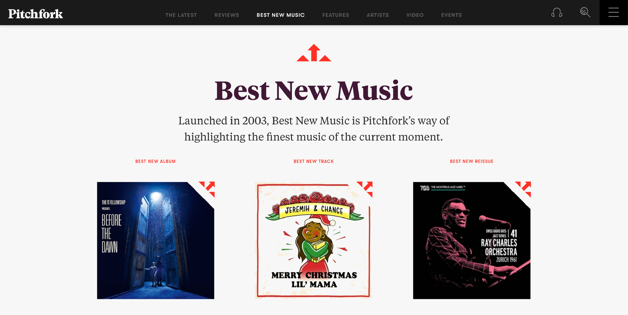
Many fans of the site were disappointed to see the hidden pitchfork shape in the letter k removed, but when you look at the clean curves and slab sarif of the new mark Grilli Type created it just didn’t fit. However, pay close attention to the iconography used on the Best New Music page and you’ll notice a small tribute to that iconic letter k from the 2011 logo. Small nods to past designs are incredibly rewarding in a rebranding and even though it was removed from the wordmark Pitchfork nailed it by using the fan-favorite icon throughout the website.
It is also inspiring to see a company like Pitchfork ignore the trend to use simplified sans serif typography that we see all over the internet, Dribbble portfolios, and the App Store. Instead, the unique lettering of their logo allows the company to connect with its audience on a deeper level. They didn’t just start calling themselves “The Most Trusted Voice in Music” by accident, they earned this trust. And it shows throughout their design decisions.
A choice like this undoubtably resonates with their long time fan base who align with its indie roots. Reinforcing core values through visual design is what sets apart the best brands. Moments like this speaks volumes to how in tune Pitchfork is with their audience. Whether it is design or music, Pitchfork doesn’t just following along with popular trends.
Looking at the Pitchfork wordmark in the header of the site I am struck with the reaction that it would look amazing as the title of a newspaper! This is a powerful connection for an online music blog to make. The use of a typeface that centers around established and elegant letter forms offers a subtle nod to the print media giants that came before them and helps Pitchfork credibility as they further instill their motto: The Most Trusted Voice in Music.
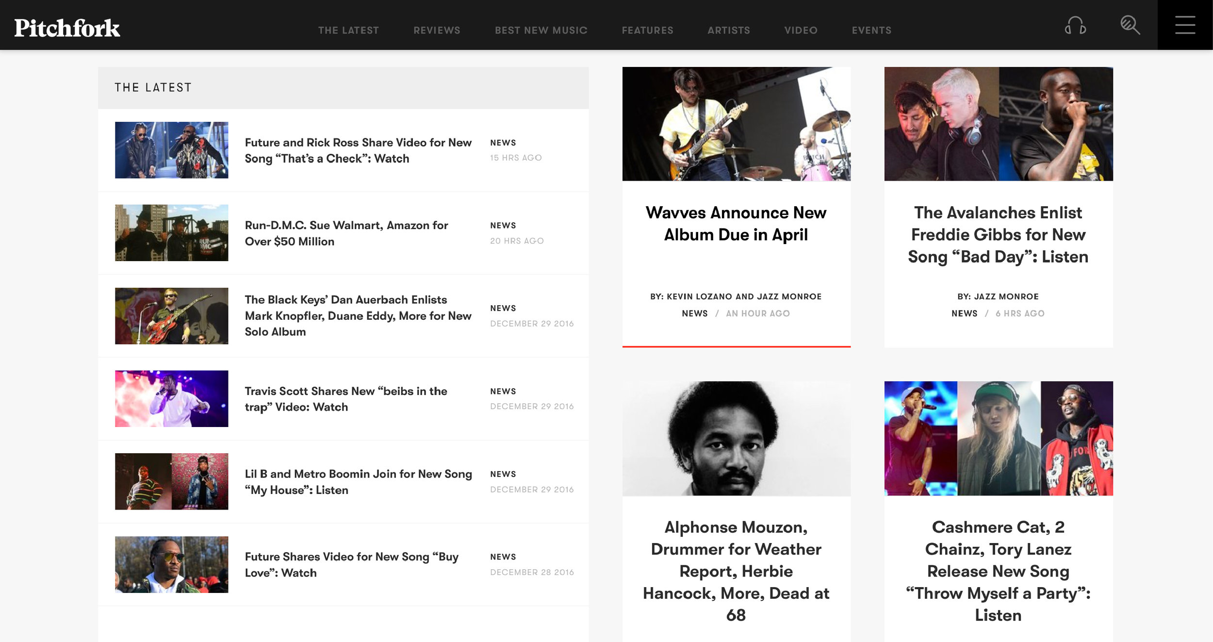
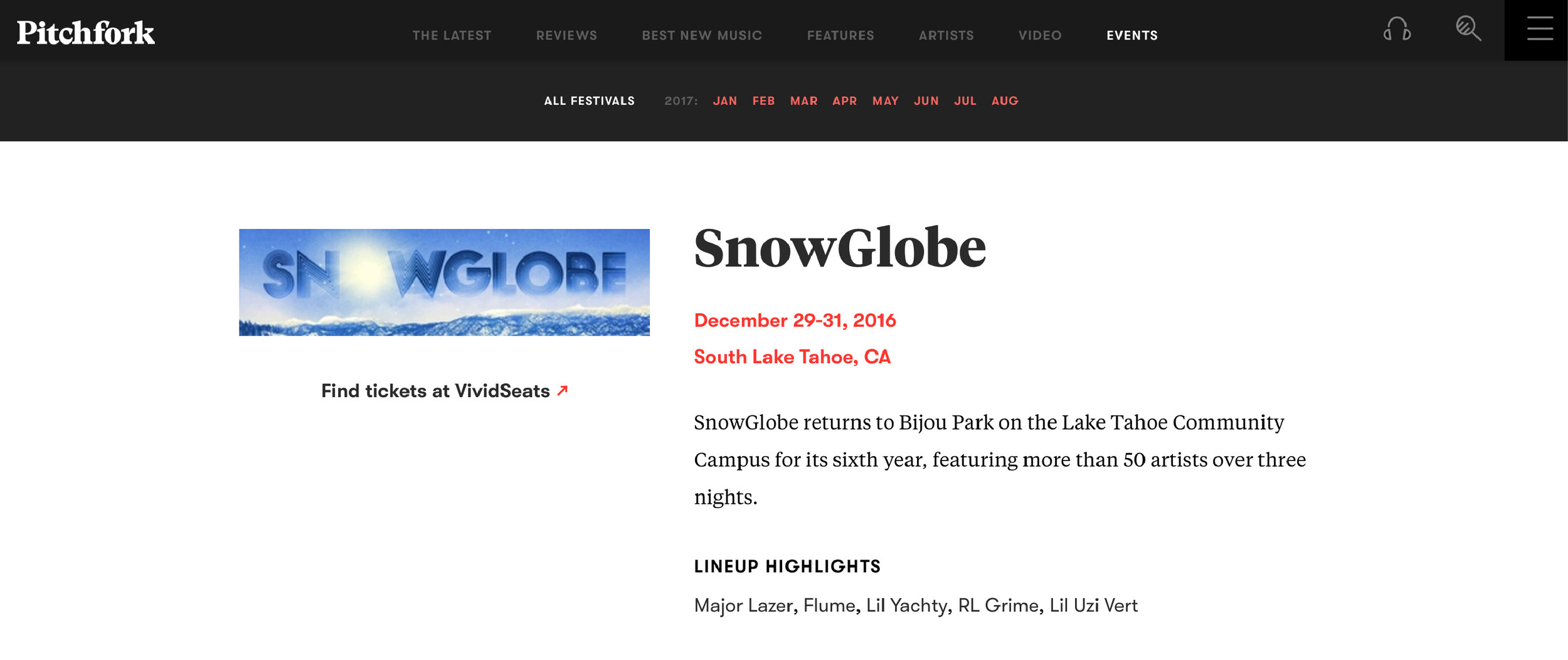
New wordmark and great typography aside, what really stands out about the 2016 refresh is Pitchfork’s gorgeous new website and mobile app. The clean colors look crisp, the grid layout obvious, and color choices intentional. All together it creates an amazing new experience that many websites will look to for inspiration in the coming year.
The simplified layout of information allows the reader to quickly and easily get the information they seek on the site. It requires more scrolling than before, but the tradeoff for added whitespace pays off immediately for the reader. A visual identity is much more than just a logo and when a company like Pitchfork does it so well, we pay attention.
The monochrome design of the site might be oversimplified to critics who say it is generic, but sometimes keeping it simple is incredibly important in design. The content of the site is king. Let that shine. By keeping things minimal, Pitchfork has created a framework that allows for its featured articles, album art, calls to action, and advertising to stand out from the rest of the site, and isn’t that the goal? This clean design is reminiscent of the bloggers paradise, Medium.com, which uses a grid layout, ample white space, and refined typography allowing the content to take priority.
In addition to the layout of their content, another thing this rebranding nailed is the color palette of the new website. Sleek. Confident. Trusted. Like a newspaper, it celebrates the monotone qualities of black, grey, and white. When color is needed, they rely on the vivid red of the circular pitchfork logo that has become a staple of the brand since the beginning. When developing a new identity, these subtle nods to the past creates value and translates to trust from the audience. Their loyal following may be shocked at first to come to a redesigned website, but as soon as they see the familiar red tone on links, iconography, and calls to action the visual language and smart design decisions bring it all back full circle. Moments like this often go unnoticed by the user, but are triumphs for designers.
Looking at Pitchfork’s entire brand refresh I am reminded of one of my favorite quotes from designer Joe Sparano, “Good design is obvious, great design is transparent.” The design decisions made by the Pitchfork team, and GrilliType in the wordmark, allow the transparency of the design to recede to the background of our minds as article titles, vivid photography, band announcements, and ads to pop off the page. It may not be the flashiest redesign, but it accomplishes a ton with just a few changes and will be looked at by many other blogs & websites hoping to refresh their look, layout, and logos in 2017.
Look & Logo is a project dedicated to the design thinking that fuels creative visual identities, brands, and logos. Follow along on Twitter or Instagram to see the latest looks & logos or follow along on Medium for more in depth discussions on design. If there is work you would like to see featured or reviewed, want to talk design, or just want to say hi, feel free to get in touch.


