Uber Redesign: A Closer Look
What do all these Atoms & Bits really mean?
Sometimes a company’s branding aspires to be more than what it actually is and sometimes we are too quick to judge them for it. The 2016 Uber redesign is a great example of both of these.
Looking back at the last decade very few companies have disrupted an industry like Uber. With a valuation of nearly 63 billion dollars, Uber is by every definition, the unicorn so many companies aspire to be. So where does all the futuristic talk of nanoscience and high-tech come from? What do they mean? How do these design elements add, emphasize, or confuse the millions of users clicking through the Uber products? Let’s take a closer look at the branding, voice, and visual identity that will propel this tech giant into the new year and beyond.
“When you push a button on your phone, a car moves across the city and appears where you are. We exist in the place where bits and atoms come together. That is Uber. We are not just technology but technology that moves cities and their citizens.” — Celebrating Cities: A New Look and Feel for Uber
There have been numerous articles detailing the highs and lows of this surprising new identity. None offer a better glimpse than Jessi Hempel’s February 2016 Wired article simply titled, “The Inside Story of Uber’s Radical Rebranding”. An excerpt of this in depth chronicle of the company’s transformation stood out to me:
“The story of how Kalanick (Uber CEO) and his design team came to replace the ubiquitous “U” logo is about more than a corporate rebranding effort. It’s a coming-of-age tale. It’s about Uber’s attempt to transform its purpose and cement a new reputation — to change not only how it is perceived throughout the world, but how it perceives itself.”
So many words in that passage stand out and it gives you a glimpse of what is in motion for this modern taxi-cab company. Infact, Travis Kalanick, the company’s CEO, and his employees would scoff at the label “modern taxi-cab company” and the connotations it carry. Inside the walls of their office, Uber is more than a 21st century taxi cab. It is more than just an app. They needed to break the connection between the brand and the reputation, so they went to the design team’s drawing board. Through a radical rebranding Kalanick & his company are making a concerted effort to redefine who they are, how they are perceived, and what the company can become.
To an extent, this is a similar shift we witnessed with Snapchat rebranding to Snap Inc. Evan Spiegel and his team realized their stand alone app is very different then the future of the company, so they recreated their company and nested the Snapchat app we all know and love under the larger brand. This is something we also saw happen with Google, albeit on a much larger scale, introducing us to Alphabet. Looking closer at the execution behind the shift from Snapchat to Snap Inc and Google to Alphabet help tell a story of where these companies were and where they are going. This could be one of the reasons the Uber rebranding is so jarring, the app and the company Uber are no longer the same thing, but expected a redesign to tell the complete story. Sometimes just changing your look and logo isn’t enough.
Along with several other tech giants (see Apple, Google, Tesla) the rumblings of autonomous cars is quickly becoming a reality. In an effort to jump in front of this curve, Uber internally switched from identifying itself as a ridesharing/delivery/taxicab service to thinking of itself as a large tech/logistics company. Kalanick explained this shift in scope with a blog post stating, “Our vision is to build a technology company that changes transportation and logistics in urban centers around the world.” The post continues further to introduce the Bits and Atoms themes (that would ultimately influence the design direction) comparing the various investors to bits and atoms in Uber’s journey to success.
However, as 2017 begins, it still seems like we still talk about Uber as a way to get to the airport on time. We don’t use the nanoscience nomenclature to think about how we are going to get home from the bars at night. This disconnect is what Uber attempts to solve; but the new branding, design, and marketing can only go so far. We are so familiar with what to expect from the app on our phone that hearing talk of atom and bits suddenly feels disconnected.
You can see these intentions in Uber’s own words when they unveiled the redesign in a blog post title Celebrating Citites, “The unique aspect of Uber is that we exist in the physical world…We exist in the place where bits and atoms come together. That is Uber.” At some level those words carry a lot of truth, but they also make me want to roll my eyes and say “yeah I get we exist in a place where bits and atoms come together…but I really just want to get home safe or not have to park my car downtown.” Uber didn’t just change its branding, it changed its entire company. But its users haven’t changed along with it…or at least they haven’t yet.
In time, we will look back and realize the radical shift was a brilliant move, especially if Uber plays a fundamental role in creating a new form of driverless transportation. That path is getting paved as we speak with the launch of the UberFreight website showcasing the recent acquisition of self-driving truck OTTO, planning to hit the roads in 2017. Suddenly the mantra “Moving Bits & Atoms” doesn’t seem so far fetched.
However, the look and logo are trying to achieve something that the product doesn’t yet deliver. The tension this creates is apparent both in the reactions to the rebranding and internally at the company. Less than a year later and the Uber app already looks different. What? Why?! Gone are the “atom” textures from the background and loading screen, instead replaced with a solid black background highlighting the “bit”.
So why has the app icon has already changed? What happened to the textured bits & atoms? The more these looks and logos change the more the user is left confused, unsure, and questioning the company…especially after such a profound introduction it the self-importance of moving bits & atoms across a globe.
The old “U” Uber icon, the redesigned “bits and atoms” icon, and the new monochrome Uber icon
The app icon, originally a letter U, was one of the cornerstones of every techies’ smartphone. I can vividly recall nights before Uber hit Seattle. It seems like a foreign world now to have to sit through disgruntled dispatch agents just to be placed on hold for 5 minutes finally requesting a ride with your street address…only to be unsure of when the car was going to arrive, how much I would need to pay, or who the driver was that’s picking me up.
Flash forward to 2017 and Uber is more than just an app that has nearly made taxis obsolete... “I’ll uber there” is a verb that teens, college students, business professionals and travelers abroad use on a daily basis. Even if someone is catching a Lyft, no one is saying they are Lyfting somewhere. It is ubering, that is the staying power of what this company has created. That is an amazing branding opportunity which was painfully missed in their redesign.
It is important to point out a few positive takeaways from the new look and logo that the Uber design team created throughout the last year.
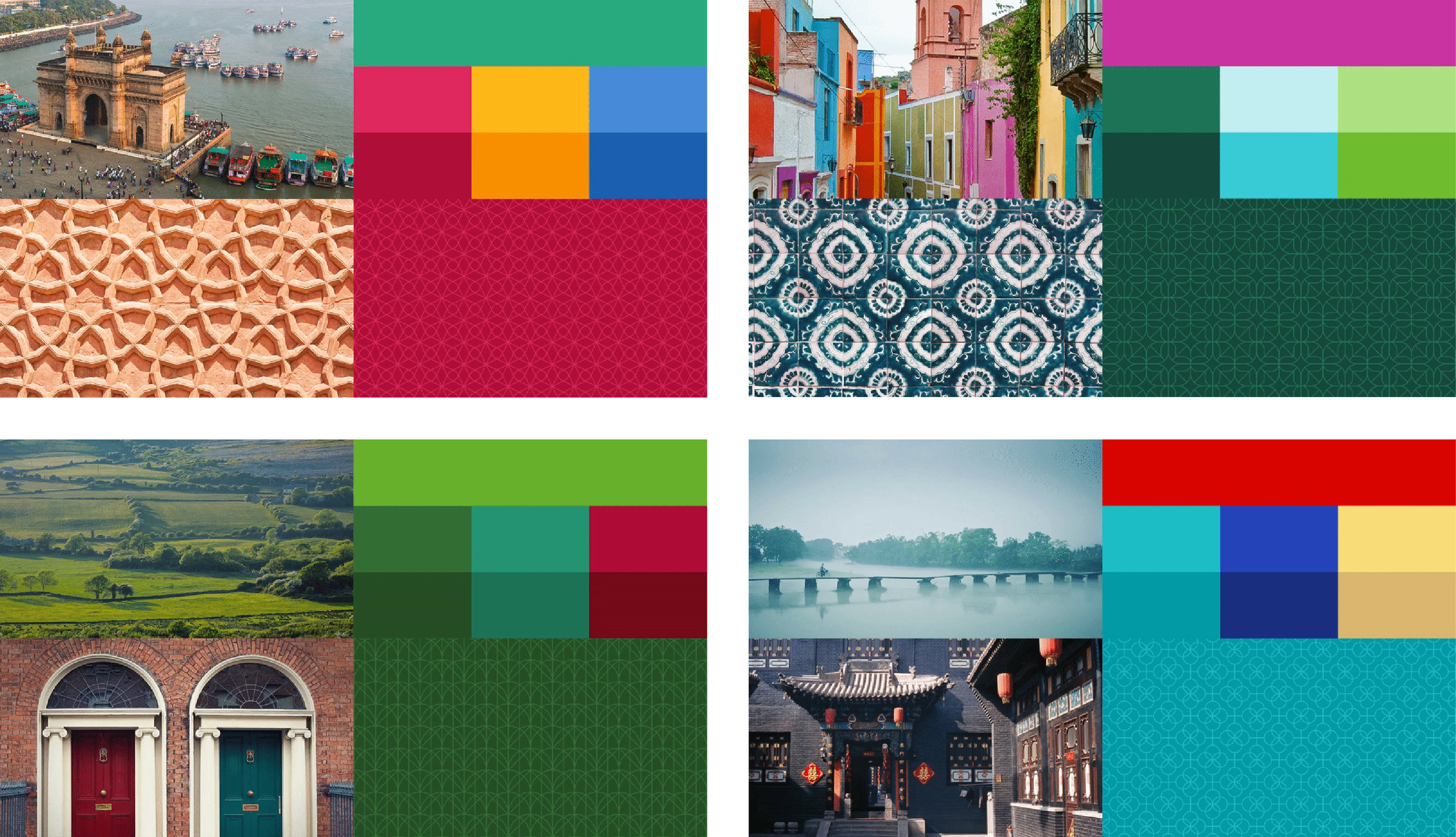
First, the use of textures and patterns is extremely rare in modern design that is in love with minimal flat design. But the added texture, which Uber refers to as its atoms, really does drive home the complexity behind the scenes.
Color palettes and texture for four global markets (clockwise from top left: India, Mexico, Ireland, and China)
Second, the use of color is extremely intentional. In the US we might only see one version of the Uber interface, but you can tell the care the design team took when considering the look of Uber in various countries abroad. This is inspiring to see in action and will be interesting to see how it comes to life in the future marketing materials for Uber. It is not the bold and consistent visual identities we’ve come to see across global markets like Facebook, Visa, Apple, or Nike. However, Uber could be on to something by customizing the representation of their product abroad that may influence future rebrands, even if we’re left sympathizing for the design team’s suddenly quadrupled workload.
Third, the depth the visual rebrand goes is extremely impressive. This was not just a reskin, this was an entirely new way of thinking about the company. New logo, icons, app interfaces, website, marketing, strategy, new products in UberDelivery, UberPool, UberFreight…the list goes on and on. It is such a massive undertaking that it comes as almost no surprise to read Andrew Crow, former Head of Uber Design, decided to leave the company after launching the rebrand. He wrote in a Medium post last February, “I’m using our recent successes as a chance to take time off to rest, reflect, and recharge. I miss being there for my kids and I’m making a decision that enables that.” Whoa.
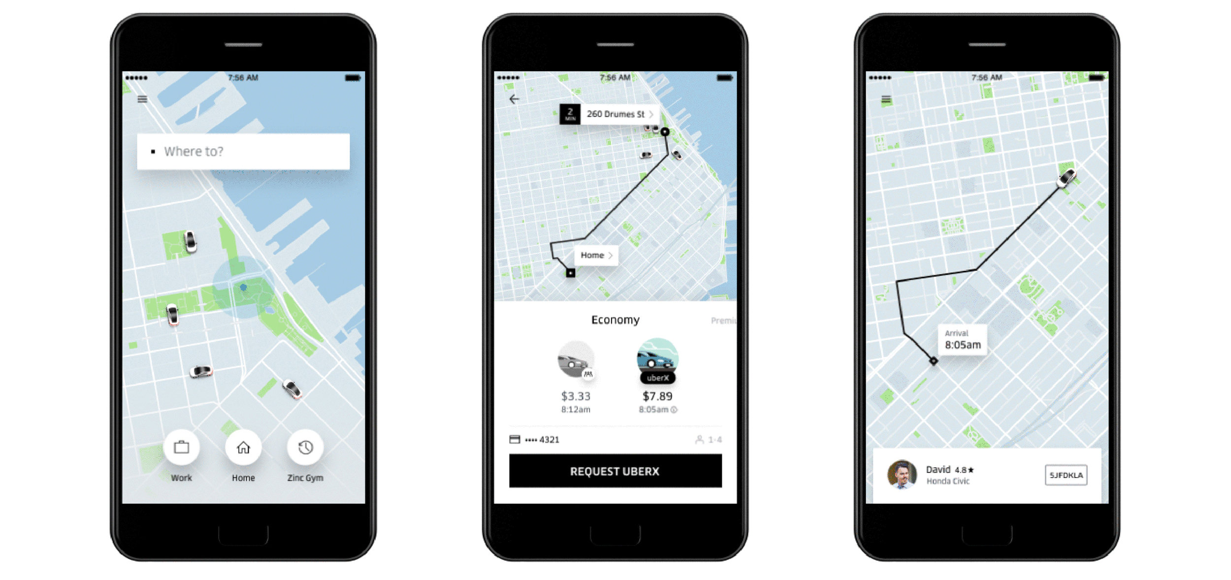
Fourth, the visual overhaul of the app is very sleek and definitely where the new branding shines. For as much criticism the new look got, the app is simply gorgeous while maintaining the a simple user interface, painless request & payment processes, and driver information. The monochrome map with minimal type allows all the important information to pop out immediately. Your location, nearby parks, and even three-dimensional cars stand out instantly (even though I wish they were the correct color of the car selected to pick you up).
Uber is one of the most successful companies of recent memory, but unfortunately a new look and logo can only go so far to change a tech giant’s reputation. The shift was incredibly forward thinking, especially with many profound projects on the horizon for Kalanick and his team, but there were too many misalignments that created confusion with the users. Branding is more than just colors, logos, and app icons. There is much more work to be done internally that will help solidify the direction, future, and identity for Uber. Once that is done, we may look back and realize the new look was ahead of its time.
Look & Logo is a project dedicated to the design thinking that fuels creative visual identities, brands, and logos. Follow along on Twitter or Instagram to see the latest looks & logos or follow along on Medium for more in depth discussions on design. If there is work you would like to see featured or reviewed, want to talk design, or just want to say hi, feel free to get in touch.


