Premier League Redesign
A visual identity as energetic and exciting as the sport
One of the freshest visual identities we saw last year was DesignStudio’s kickass new look for the Premier League. The Premier league didn’t need to rebrand, it had an awesome look and a steady stream of money and fans, but it did it anyway. Why? Unlike a change in growth, scope, or audience we saw with other companies on The 10 Most Influential Rebrands of 2016 the Premier League is setting a new standard for what a sports league could look like. They have the best players, best teams, and now arguably, the best design to match.
I wish I could be a fly on the wall for the design bidding, conceptual development, and pitches for what a new English Premier League identity could look like. The rounds of logo ideas and wordmarks and colors DesignStudio sorted through would be amazing to see…but it’s hard to imagine anything other than the fresh, clean, cool look of the 2016 Premier League.
If you take a look at DesignStudio’s work you’ll see some amazing names in client list including Airbnb’s fresh 2015 rebrand, Logitech’s sleek new logo, and the forward thinking Deliveroo visual identity. There is something great going on inside the walls at their London/San Francisco offices. As more big name companies push for design thinking, agencies who can keep up and execute to the highest degree, like DesignStudio, will have a chance to leave an amazing mark on the industry.
As a designer, it is inspiring to see such an iconic titan like the Premier League look to rebranding as a solution to some of their most complex questions. As they move into a new era of popularity where the superstars couldn’t be bigger, fandom is at its highest, cinderella stories like Leicester City dominating the headlines, and the fanaticism surrounding the upcoming 2018 World Cup only continue to push this sport to new heights. It makes sense that the Premier League wanted a fresh look and logo to help propel them into the future of 2017 and beyond.
Do yourself a favor, take a break from reading about the English Premier League and just watch the video DesignStudio put together as an overview: https://www.wearedesignstudio.com/works/premier-league-rebrand/
Now that your adrenaline is pumping and you have seen a glimpse of the new lion logo, let’s let the creative group responsible implementing DesignStudio’s new identity, DixonBaxi, introduce us to the rest of the look:
As a sports enthusiast, I am pumped. As a designer, I am blown away. I am not sure if it is real life or a video game, but I can’t stop looking at the work these companies produced. They sum it up perfectly in three words: Radical. Inspiring. Global.
The Premier League is setting a new tone for its sport and I am beyond excited to see it come to life. I started watching soccer (football) and following along the Premier League website just to see this visionary new look play out across different mediums.
Sports teams are the perfect use case for branding to shine. They are a place where logos, identity design, color combinations, apparel, photography, and video all flourish. Think of all the awesome jersey combinations you’ve seen. Stadiums filled with the colors and logos of a team. The color combinations or apparel in team stores. These are all expected from a professional sports team. But rarely do we see such a radical shift from the entire league!
It is pretty badass to give your league as a whole their own mascot rather than an emblem like the NFL shield or a personification like the MLB or NBA, but when I look at a lion wearing a crown I can’t help but think of the regal, powerful, unapologetic connotations that come from the best of the best. And thats what the EPL is. Add the vibrant colors, textures, and cool photo treatment and this new look is fueled with energy and excitement before the matches even kickoff.
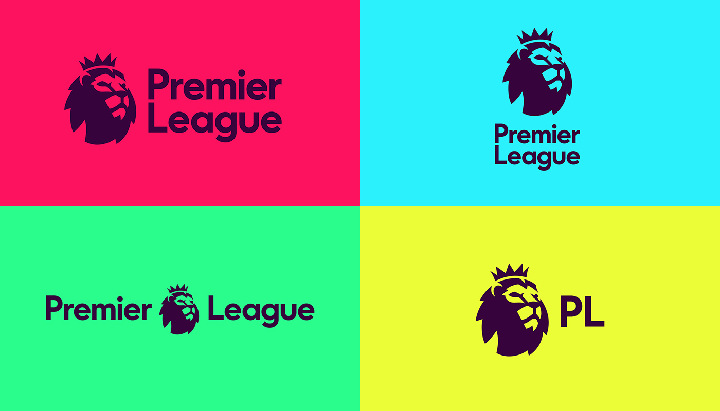
A nice touch to the design is the color selection for the logo itself. It is subtle, but a moment worth celebrating. DesignStudio moved away from the dark blue of the prior logo and introduced us to a new rich dark purple. By just using this color for the wordmark and the lion it helps to reinforce the regal, talented, powerful qualities of the league. While also working great as a compliment to the vibrant alternate colors. These vivid pinks, blues, greens, and yellows are used to energize and excite the audience across the globe. No matter where you live or what language you speak you can’t help but notice the colors.
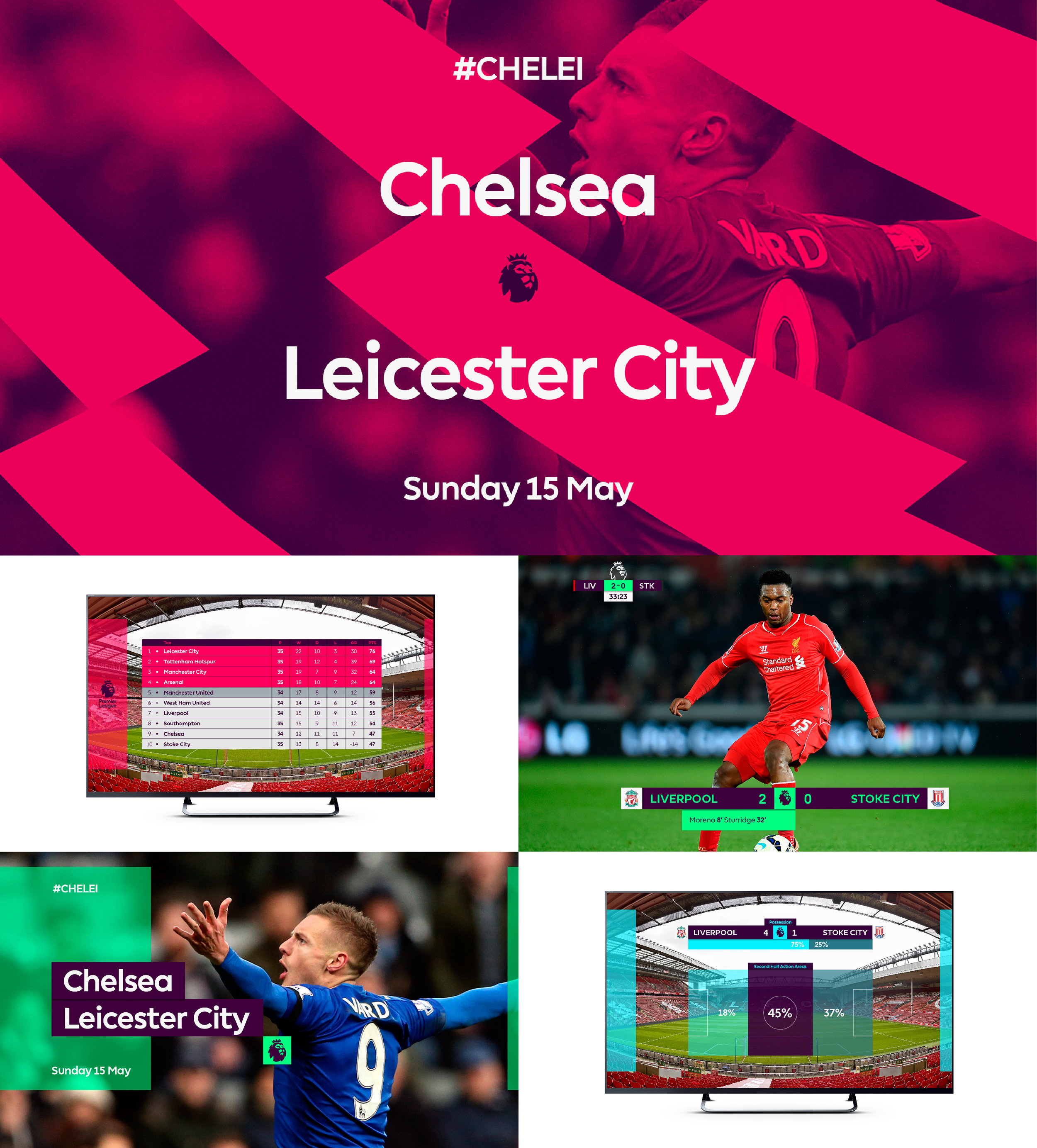
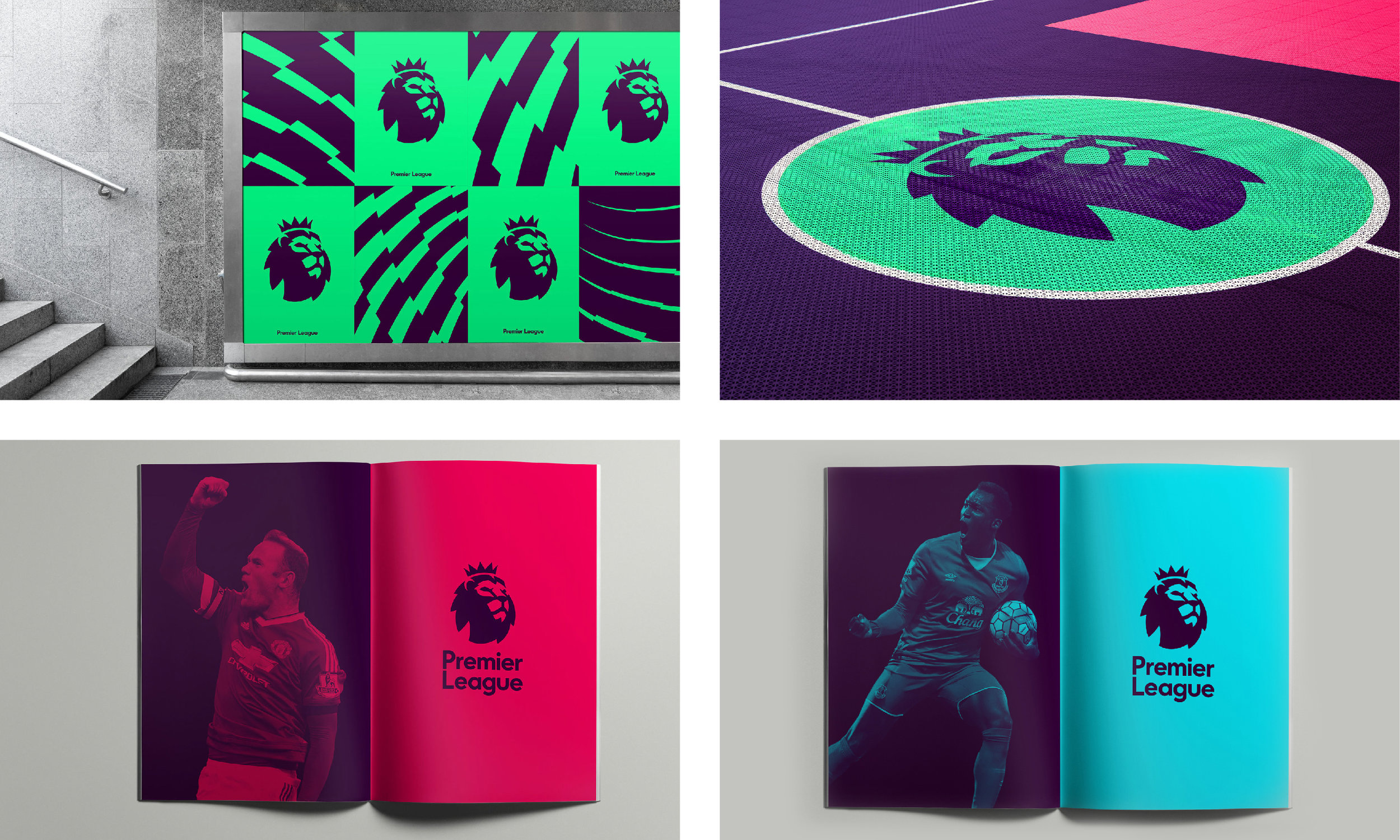
When used as solid colors they are a little much, leaving the eyes exhausted and seeking white space, but used as a tone or overlay for marketing and on the television they work extremely well. We are taught that ‘design is in the details’ and seeing how successful a set of color combinations work across a multitude of use cases is a credit to DesignStudio’s attention to detail. The colors pop and without even seeing a logo you instantly notice you’re watching the Premier League.
Moving away from color let’s take a look at other parts of the visual identity. You will start to notice a trend here in the Top Rebrands of 2016 is the simplification of established logos to better suit growing digital needs. The objective might not be as clearly stated as it was for the Mastercard Rrebranding or Alaska Airlines Rebranding, but optimizing for digital is something every brand needs to consider as we move into 2017.
We are in an era dominated by smartphone screens, social media shares, and apps so a brand identity needs to work on at all sizes. This means design goals are to serve both needs: be recognizable when scaled down while at the same time impactful at full scale. Especially when it is used to create brand awareness like in advertising, or in the Premier Leagues case, a stadium jumbotron! As you can see from their new app icon, this simplified design does just that. The lion is prominent. The color pops (maybe too much) and the text and line weight isn’t reduced to an illegible size.
In another move to simplify the logo, this new look removes the soccer ball (football) from the logo all together. This is a growing design trend that will continue to boom as startups and young companies created in the last 10 years become more mature. Suddenly these brands no longer need design elements, iconography, or a soccer ball to help distinguish what they are. IMB and Apple don’t need to have a computer in their logo nor does Nike need a shoe or McDonalds a burger. The same is shown here. The majestic lion may no longer be pawing a ball, but did he really need to be?
I am more excited than ever for the Premier League to be shown across various tv stations here in the states and a chance to see this sexy redesign in action. From the looks of it, the football fans are in for some visual stimulation rarely seen on a sports field (unless it’s the Seattle Seahawks color-rush NFL jerseys!). The examples DixonBaxi shows off on their website are breathtaking. The combination of colors, animations, color blocking, and overlays is frankly something you’d expect from a music festival or the next young tech startup. This is a testament to a forward thinking strategy by the Premier League and a daring visual identity by DesignStudio and DixonBaxi that bring the energy and excitement off the field and into the brand.
Look & Logo is a project dedicated to the design thinking that fuels creative visual identities, brands, and logos. Follow along on Twitter or Instagram to see the latest looks & logos or follow along on Medium for more in depth discussions on design. If there is work you would like to see featured or reviewed, want to talk design, or just want to say hi, feel free to get in touch.


