
Most Influential Redesigns of 2018
Highlights from an interesting year of design
For many of reasons, 2018 felt like a year that would never end. But we made it through and here we are looking back with a fresh perspective at some of the redesigns that helped shape the landscape of our industry and shed some light on what we can expect next. Everyday users are becoming more and more savvy to advertising and demanding more from our corporations. No longer is a logo or color palette enough to differentiate, but a companies values, mission, and tone of voice are becoming the differentiators. These are some of the companies that took on the challenge of rebranding in hopes to change, grow, or reinvent themselves in our eyes. Let’s see what we can learn from them.

Ad Age
One of the freshest new looks of the year is a reinvigorated redesign of AdAge. Last September, the New York based AdAge introduced a new identity created by OCD that has people looking to AdAge not just for inspiration on advertising campaigns, but also their own look and logo. The company is known for “curated creativity, data and analysis, people and culture, and innovation and forecasting” and now has a modern brand to match its growing footprint in our online society rather than the original magazine publication that calls back to a Mad Man era far gone. However, the new logo does achieve a call back to the 1930s in a subtle & elegant way utilizing the unique g shape from the original AdAge logo. This instantly identifiable logo is perfectly paired with bold color blocking to create a brand system that will last for years to come.
Read More

Uber
It has been quite a wild ride for the ride sharing unicorn, but as the company transitioned to a new CEO it smartly ushered in a new PR strategy and visual identity. Gone are the days the CEO of the company sat in on design reviews and instead turned to user research to better understand the costumer & connect with them in a new way. “We set off to learn what the business needed globally during a period of transition. We used our learnings to drive our work of creating a brand that both served our business and engaged our audience.” No longer is the brand communicated through metaphors about bits & atoms but instead in everyday language, with a surprisingly human identity that seeks to connect (or repair their relationship) with a massive user base. This empathy toward the consumer was much needed, but a bad taste of past experiences & pr nightmares is still left in many users memories. the Uber website continues, “As a brand, we believe movement ignites opportunity. The brand system highlights movement as effortless as tapping our app to request ride and offers options to celebrate the endless opportunity movement makes possible.”
Read More

ClassPass
If you want to see a sprint ahead of its competition through great design and branding check out the amazing work the internal team at ClassPass launched in 2018. The photography and art direction is some of the best I’ve ever seen. When a company’s product, marketing, and audience are all aligned beautiful things happen and that’s exactly what we see in the ClassPass branding. What really comes to life in the new ClassPass advertising is the intention behind the ads. They are amazingly well crafted down to the details of the colors, the clothing, the composition, and ultimately inspiring us to sign up for their classes.
You can hear that intent in the way the company itself talks about the redesign, “After five years and millions of workouts, it’s good to take stock of what we’ve done and where we’re headed.” Creative Director, Greg Hathaway, continues to elaborate saying, “At its best, the new ClassPass brand celebrates the way you push yourself every time you press “book.” And with all this work, we want you to feel inspired — inspired to do things, to try new things, to find your thing.” Great branding inspires the users, and ClassPass rocked this redesign.
Read More
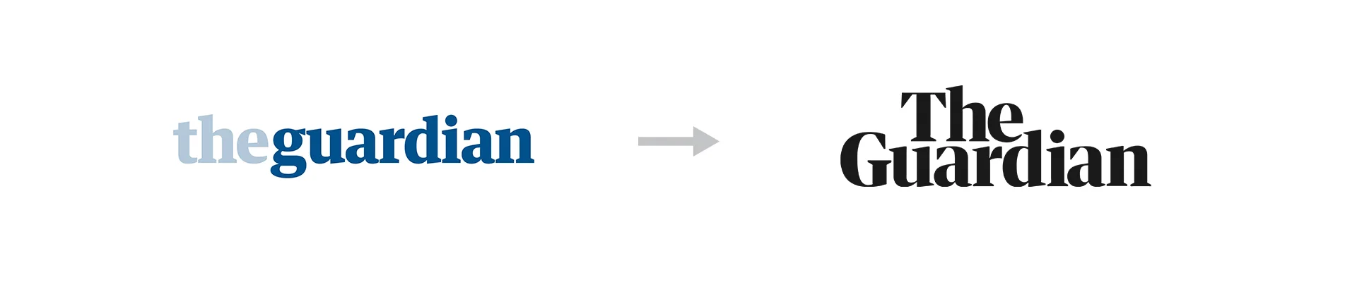
The Guardian
The 2018 Guardian redesign brings back memories of the sophisticated look done by Pitchfork in 2016. Instantly noticeable in the redesign is the replacement of the paper’s blue and white wordmark with a stylized black type. The Guardian collaborated with Commercial Type to introduce a new font called Guardian Headline to shape their branding. “[Guardian Headline] is simple, confident and impactful,” said editor-in-chief Katharine Viner in a statement. “We’re using a range of energetic colours, and the much-loved Guardian visual wit and style remain at the heart of the look." Here is a brand that knows themselves and were smart enough to get ahead of their shortcomings to build an identity to usher in a new era of viewers and readers.
Read More

Evernote
I can’t help but have flashbacks to the Medium redesign looking at the latest Evernote branding. Maybe it’s the move away from a too vibey green, or the thick serifed black font, or the detailed focus on making the UI legible for their users, but the latest iteration of the Evernote brand is here to stay. The refinements to the elephant icon make the logo look much smoother, even tho I have to side with the users who went to social media to complain that the elephant’s eye looks too angry. If that’s the biggest feedback users have about a redesign I’d say you did a pretty good job! The Evernote team enlisted the help of the rockstar design group, DesignStudio, who rose to fame with their amazing redesigns of the Premier League and Airbnb, who helped in-house team “develop a fresh, energetic and modern visual system.” The team should be proud of the next phase of the product and its overall brand. “The overall effect is optimistic, clever, confident and clear, more trustworthy than trendy.” When the two logos are laid out next to each other like above, it’s clear which one is focused on being trustworthy rather than trendy.
Read More
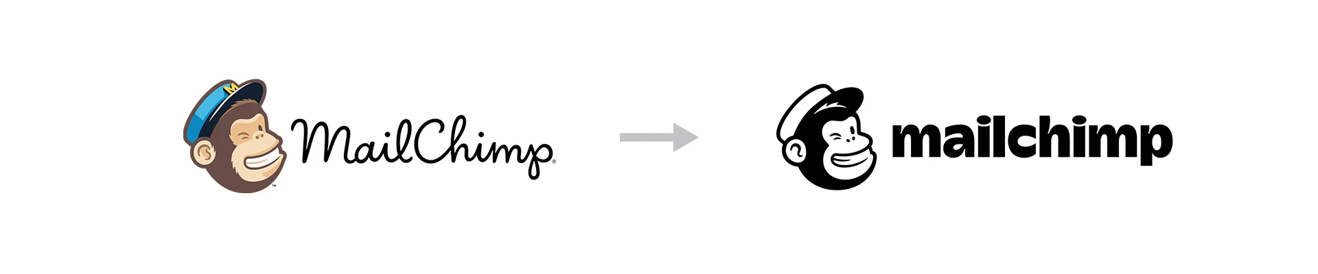
Mail Chimp
This redesign is too great not to include, mostly because it is so rare to see a brand have so much fun - be so unique in their own style - that we all can’t help but notice. The new logo and wordmark for mailchimp makese sense, they needed to simplify their look and logo while maintaing the elements that made it wonderful in the begining. There is the same monkey, but his hat is now much cleaner, with a little path of hair added to create depth, and the stylish letters are amazinging unqiue while still being very legible. A hard combination of traits to manage. “We’ve updated our logo, wordmark, typeface, colors, and imagery like photography and illustrations.” The 2018 redesign really takes off when you start to see the colors, imagery, and illustrations come to life. So unique and so well done.
Read More

Qualcomm
In January, Qualcomm introduced a new identity in the middle of the highly trafficed CES conference to some rave reviews. The new look and logo was designed by the well respected Interbrand and masterfully modernized one of the iconic software brands. In comparison, the old logo feels so out of place. One of those things you never knew was tragically wrong until the right thing is right in front of your eyes. The odd decender and thickness of the Q, mismatched next to bazaar letter combinations (each letter seems like it is from a different font family), even weirder kerning of the l, c, o letter combinations, and then finally the iconic double m. It is amazing to look at this new Qualcomm logo and think anything else was ever approved. Sometimes the best designs are the simplest. Interbrand went even further with the new Qualcomm logo playing with 3D negative space, color gradients, and a new illustration style which all help add a vibrant character to the otherwise complex company.
Read More

Bank of America
No doubt you’ve heard of Bank of America and as someone who uses their banking, I was shocked to hear there was a redesign in the works. Why? Because nothing on their website or mobile app has been updated. There is no doubt some things get help up in a roll out of a rebranding on as large of scope as Bank of America, but this one left me scratching my head wondering where did it go? According to the bank, the rebranding was built around the question “What would you like the power to do?” so a bolder all cap version of the wordmark begins to sell that story and where the rebranding really shines is with the new flag icon that finally has a shape and symmetry that makes sense. For a corporation hoping to unlock the power of its customers (and their savings accounts) it makes sense that their logo now more resembles something you’d see on a super hero instead of a checkbook.
Read More
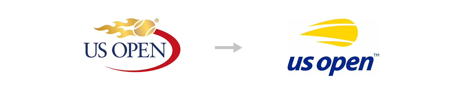
US Open
The US Open is one the four major tournaments in tennis’ Grand Slam, but this redesign seems more like a first serve fault than an ace. It is apparent that the US Open logo & branding needed some new life hit into it, with the old school serifed font, muted colors, and metallic sheen, but the new branding doesn’t quite hold serve. The design firm Chermayeff & Geismar & Haviv are quoted saying, “The new mark is an evolution of the flaming ball idea, distilled to its essence to work as a simple icon…The result expresses the energy, spirit, and velocity of the flaming tennis ball and the US Open itself, while modernizing the look, providing a more youthful appeal, and optimizing the identity for applications on everything from apps and Instagram to billboards, print ads, and swag.” The problem is that it feels a little too juvenile. The curves of the flaming ball seem disproportional, the colors have very little life to them and don’t look great when not on white, and the letters in the logo are lower-case… but anytime it is written it is spelled “US Open” which all add up to some clunkiness in the execution. In tennis you get a second try if you fault, if only that were the case with this redesign.
Read More

Look & Logo is a project dedicated to the design thinking that fuels creative visual identities, brands, and logos. Follow along on Twitter or Instagram to see the latest looks & logos. If there is work you would like to see featured, want to talk design, or just want to say hi, feel free to get in touch.