Guinness Beer's New Look
Not Every Design Needs to be Flat and Minimal
Once in awhile there is a look or logo that stands so far out of the crowd that it just can’t be ignored. This year, countless brands unveiled new minimalistic identities, flat logos, and simplified color palettes. So when a company turns its head on a trend and sprints in the opposite direction we take notice. The contrast in cliche catches our attention, especially when executed with the finesse and beauty Guinness accomplished with their new branding.
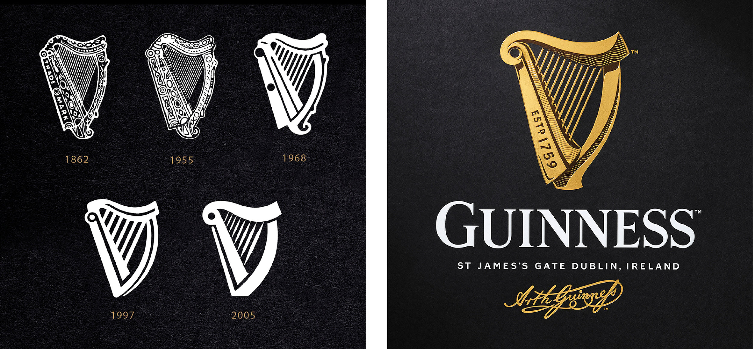
It is amazing to compare these logos side by side. The old logo, designed in 2005, is something I would expect to see on a professional designer’s 2016 Dribbble page. The simple typography and flat design have all the qualities a modern logo designers strive for, but branding can be a tricky thing. It goes way beyond a slick looking logo. A stand out visual identity is one that resonates a harmony created between a brand’s core values, its product, its voice, its audience, and ultimately allowing good design (both in product and in marketing) to tie it all together. This harmony sings out in Guinness’ rebranding as well as many of the other looks & logos covered in the Top 10 Most Influential Rebrands of 2016.
“The harp had begun to lack depth and character. It had become a distinctive shape with no soul. Our challenge was to breathe life back into the harp and let it sing once again…” — Tim Vary, Creative Director of Design Bridge
With the goal of breathing life back into the design, the sophisticated new logo seems to echo the values of the world renowned beer company. Suddenly the rich attention to detail of the brand matches the quality and reputation of the company and beer it represents.
Another reason this new look is so successful is understanding the medium we interact with the Guinness brand. This isn’t a company reliant on the internet or social media or an app. Instead, we experience Guinness in person. Holding their glasses, seeing their packaging, or watching their advertising. See the embossed details given to the harp and richness of detail in person are moments the beer enthusiasts will connect on another level with the company. I can instantly envision an ad on tv with panning closeups moving over the intricate curves of the logo…the famous foam settling in the background…the condensation dripping down the glass. Damn, now I’m thirsty.
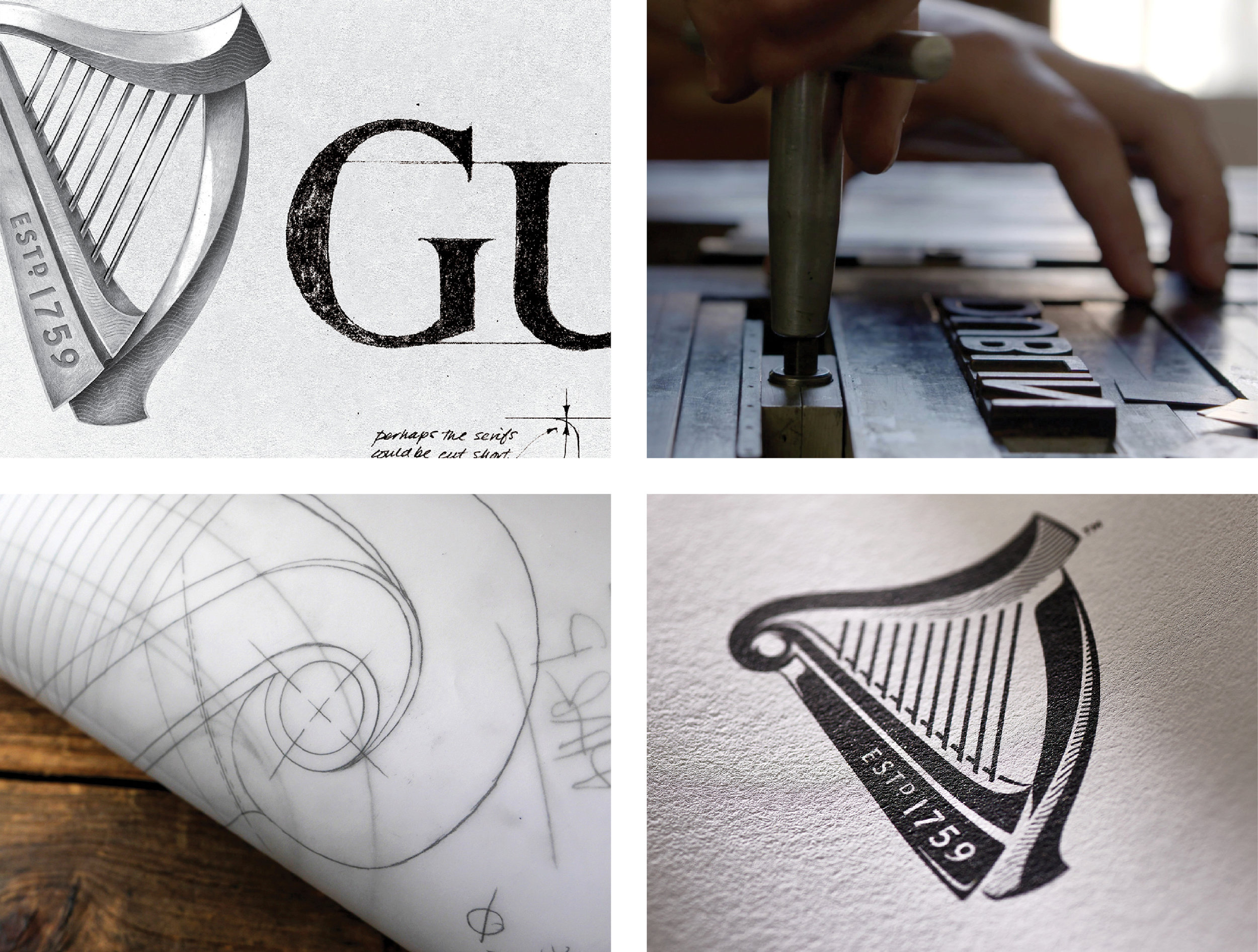
Details of Design Bridge’s new harp brand mark
As a designer, we get so enamored with creating our work on our computers or tablets that it is easy to lose the tangible qualities which are so important for brands that we hold, touch, see in real life not on apps/webpages. To read that Design Bridge closed their laptops and sought assistance from other industries is incredibly inspiring. They consulted with Niebisch & Tree, who specialize in making harps, for guidance on the legitimacy of past logos and their conceptual sketches. “We didn’t want to make one up and not have a true visual representation of a harp,” says Tim Vary, creative director at Design Bridge.
Pushing the design even further the design agency collaborated with letterpress professionals, New North Press, to test various printing techniques. The guidance from New North Press and Niebisch & Tree inspired the gorgeous lines and shading we see in the final logo which add an entirely new character to the brand.
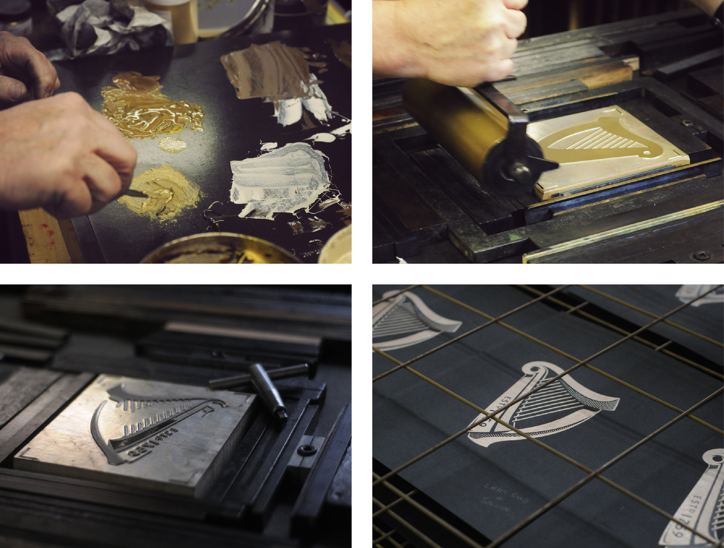
In the in-depth recap of the project “Hitting the Right Note” for Creative Review, Rachel Steven summarizes the elaborate methods of the letterpress process, “The physical impression was created by splitting the design into layers and overlaying different colours, textures and printing techniques, from metallic inks to debossing and foil blocking.” Suddenly the breweries motto “Made of More” rings true with a brand mark that has gone to extreme lengths to represent the brand, history, audience and beverage it represents.
Various printing techniques tested by New North Press
The level of detail executed in the design is practically unheard of in an era dominated by apps, social media, and flat design, but the added complexity is what provides the character and life to the identity that Design Bridge instantly noticed was lacking from the brand. Seeing them go to new lengths to consult with other creatives is a testament to their process as an agency.
As we move into 2017, Guinness serves us all a good reminder that not everything needs to be sleek and flat. Many brands will look to the simplification of their identities to fit the growing demands and constraints provided by digital media, but branding goes much further than just a look and logo. Connecting a visual identity to the ethos of the company or product will create the rich harmony you can almost hear echo off Guinness beautifully crafted harp.
Look & Logo is a project dedicated to the design thinking that fuels creative visual identities, brands, and logos. Follow along on Twitter or Instagram to see the latest looks & logos or follow along on Medium for more in depth discussions on design. If there is work you would like to see featured or reviewed, want to talk design, or just want to say hi, feel free to get in touch.


